Sound isn't a finishing touch. It's part of the scene.
Challenge
Approach

Outcome
AI video tools can add sound effects, but not a musical score. Visuals and music are still made separately, and making them feel like one piece is left to the user.
Synora connects the prompts: what you wrote for the visuals carries into the music, and the system reads the video to match the score to its pacing.
A platform where visuals and music are created as one piece, so users can focus on their vision instead of fitting the two together.
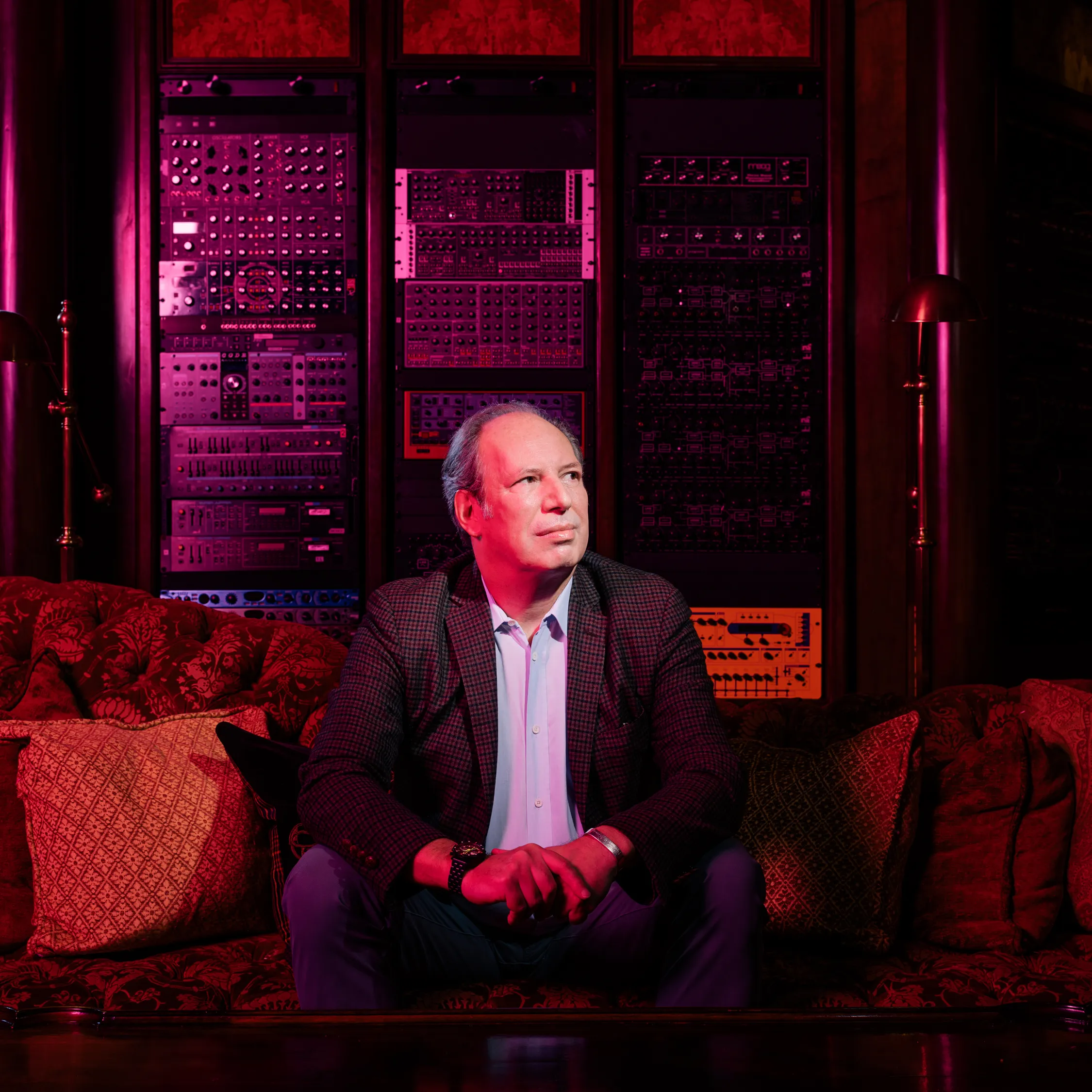
Hans Zimmer
Who is he?
Two-time Oscar-winning film composer (The Lion King, Inception, Interstellar, Dune, Rain Man).
Zimmer often writes music before filming begins. For Interstellar, he composed from a single page Nolan gave him, before seeing any footage.
Some of his beliefs
 Blending orchestra and electronics
- Music that exists before the picture
- Building scores from sounds, not just melody
Each of these shaped a design decision, shown below
Research
Visual AI Tools


Kling

Midjourney


Higgsfield
Generate strong visuals from a prompt. Some add audio, but it's sound effects, not music.

Music AI Tools

Lyria
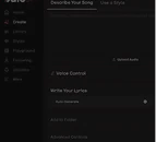

Udio
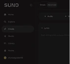

Suno
Generate full tracks from a prompt, but without seeing the scene they're meant for.
Across both, the interfaces feel alike: mostly dark, neutral, and technical.
Synora needed to feel more cinematic.
Information Architecture & Flow
The structure follows patterns users already know from AI tools, so the attention goes to what's new:
The visual prompt carries into the music.









Screens Concept
Windows peeking into other people's worlds.
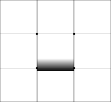
The home page is a grid of windows, each showing a world someone created.
It shows what Synora can do, and invites people to look closer.
Design System
Logo & Symbol
The wordmark combines serif and sans-serif letterforms, the same fusion of acoustic and digital found in Zimmer's work. The symbol takes the O as a camera lens, with the AI spark at its center, looking into the worlds people create.

Typography
Synora sits between film and music, handmade and artificial. Recia, a serif, brings the cinematic, handmade side. Plus Jakarta Sans, a geometric sans, brings structure and a technological feel.
Recia
Aa
Plus Jakarta Sans
Aa
Display
Content
Colors
Early wireframes were black and white, and felt technical and cold. I looked for a color between the warm, handmade side of a live orchestra and the cold, electronic side of synths.
I chose Peach for the warmth while staying soft and calm.
Black
#110F0F
Base
White
#F7F3F1
Base
Peach
#FF8A65
Accent
Buttons & Icons
Simple outlined icons keep the interface quiet next to the worlds. Every component has light and dark versions, since the product moves between dark browsing and a light creation canvas.


From Critique to Final
“It doesn’t look like an AI platform”
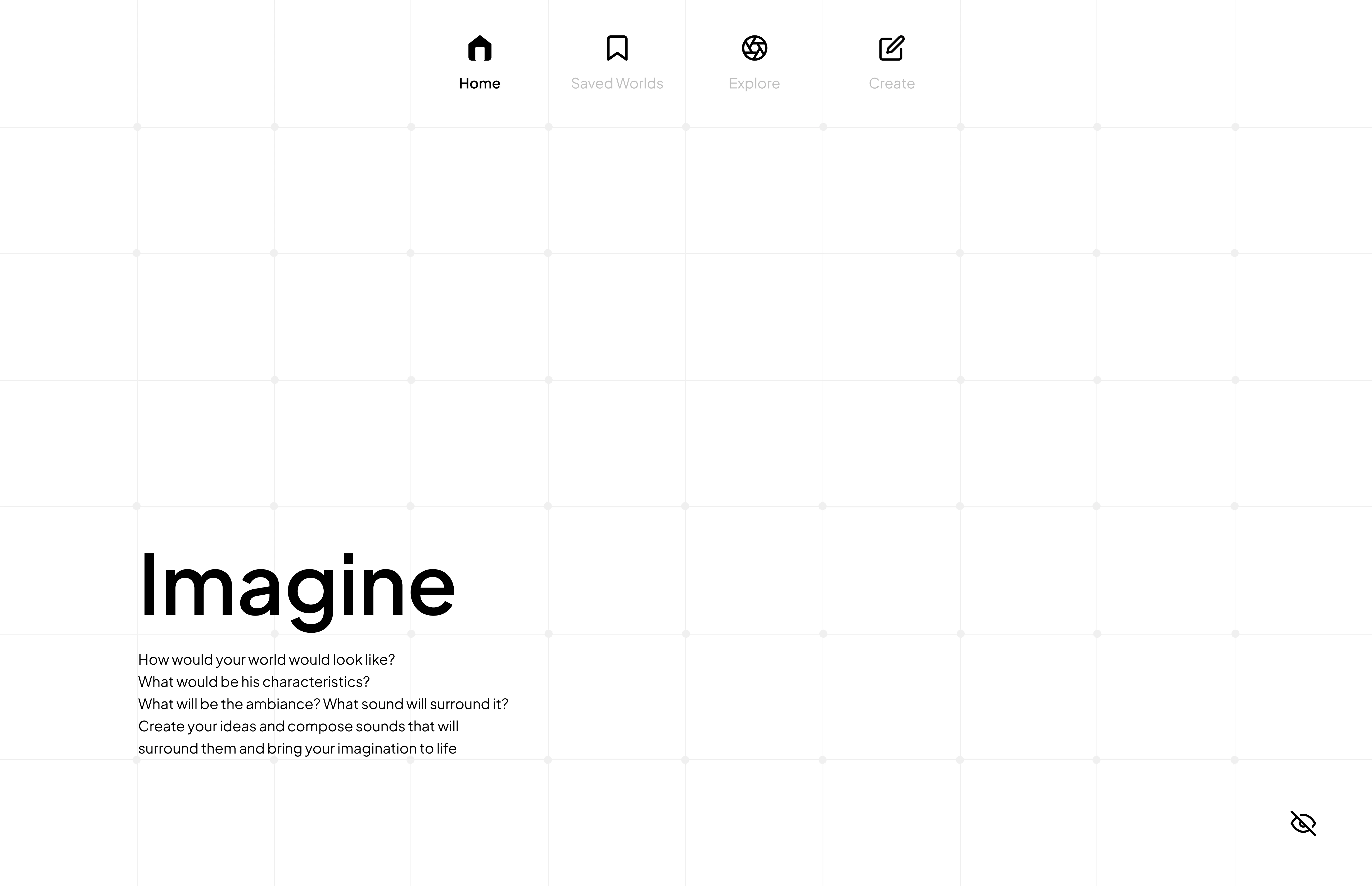
In the final class presentation, the feedback was clear: people expect to enter an AI tool and start creating right away. The early version explained the idea instead of inviting people in.
So the structure changed: a prompt bar moved to the top of every page, navigation moved to a sidebar, and the worlds took the full screen.
See it in action
A working prototype of the final design,
where you can browse worlds and try the create flow.